voyager
Reimagining Luxury Residence Booking for Mobile
Voyager offers fractional ownership of luxury residences across 25+ countries. Unlike traditional vacation rentals, properties are exclusively for investors, never rented publicly. Investors build equity in appreciated real estate while enjoying meticulously maintained homes with full concierge support, combining investment returns with vacation experiences.
my Role
Solo Product Designer
Timeline
6 Months
Platform
iOS, Web
Team
2 Developers, CTO

Overview
The problem
Investors were stuck using a desktop website on mobile devices, requiring constant zooming and scrolling through multi-step booking flows. Poor mobile experience led to frequent support calls, with users abandoning bookings mid-process to call account managers instead.
My solution
A mobile-first iOS app empowering investors to independently search residences, book stays, view balance impact, and manage trip itineraries - all without contacting account managers.

Before
After
Persona
Meet the user
Brian Smith, 58, recently retired financial advisor, represents Voyager's largest investor demographic. After years of using trading platforms and financial software, Brian is tech-savvy but expects intuitive design that respects his intelligence. He makes booking decisions on-the-go between activities. Brian embodies 68% of Voyager investors.

User Persona
Challenge
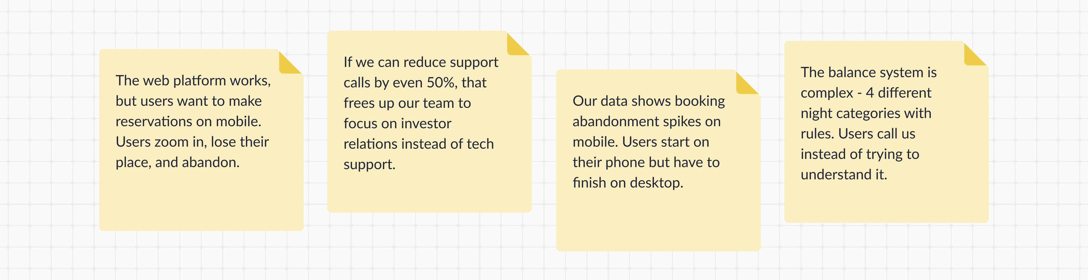
The existing web platform created three critical problems
Clunky Mobile Booking
Multi-step flows required constant zooming and scrolling on mobile screens. Users struggled and abandoned their bookings mid-flow without completing.
Hidden Balance Information
Complex night allocation across four-plus categories with rules was scattered across pages. Email statements got lost. Users called support asking "Can I afford this trip?"
No Itinerary Creation
Users relied entirely on account managers to plan activities. Static PDF lists sent via email required phone calls to book. No self-service tool existed to manage trip schedules.

User Journey Map
Business Impact
Abandoned bookings and support calls increased operational costs. Account managers coordinated activities and explained balances instead of building investor relationships, creating unsustainable bottlenecks that prevented platform growth.
research
How I conducted research
Interviewed stakeholders for vision
Stakeholders emphasized mobile-first advantage and resource constraints requiring prioritization.
Watched investors struggle online
Observed zooming and scrolling frustration identifying abandonment points during flows.
Reviewed other booking platforms
Analyzed competitor search patterns and balance displays to identify familiar patterns users already understand.
Analyzed booking data together
Uncovered 45% mobile abandonment rate and 8-minute average booking time on web.
Conducted SWOT analysis
Identified self-service opportunities while revealing balance system as weakness.
Conducted heuristic evaluation
Reviewed website against usability principles identifying recognition and prevention gaps.

SWOT Analysis
Stakeholder Interview Notes
Heuristics Evaluation
I conducted a heuristics evaluation using Jakob Nielsen's 10 usability principles to assess the Voyager platform's existing web interface. I systematically reviewed each screen against established usability criteria, documenting violations with severity ratings (1-5 scale) to prioritize fixes.
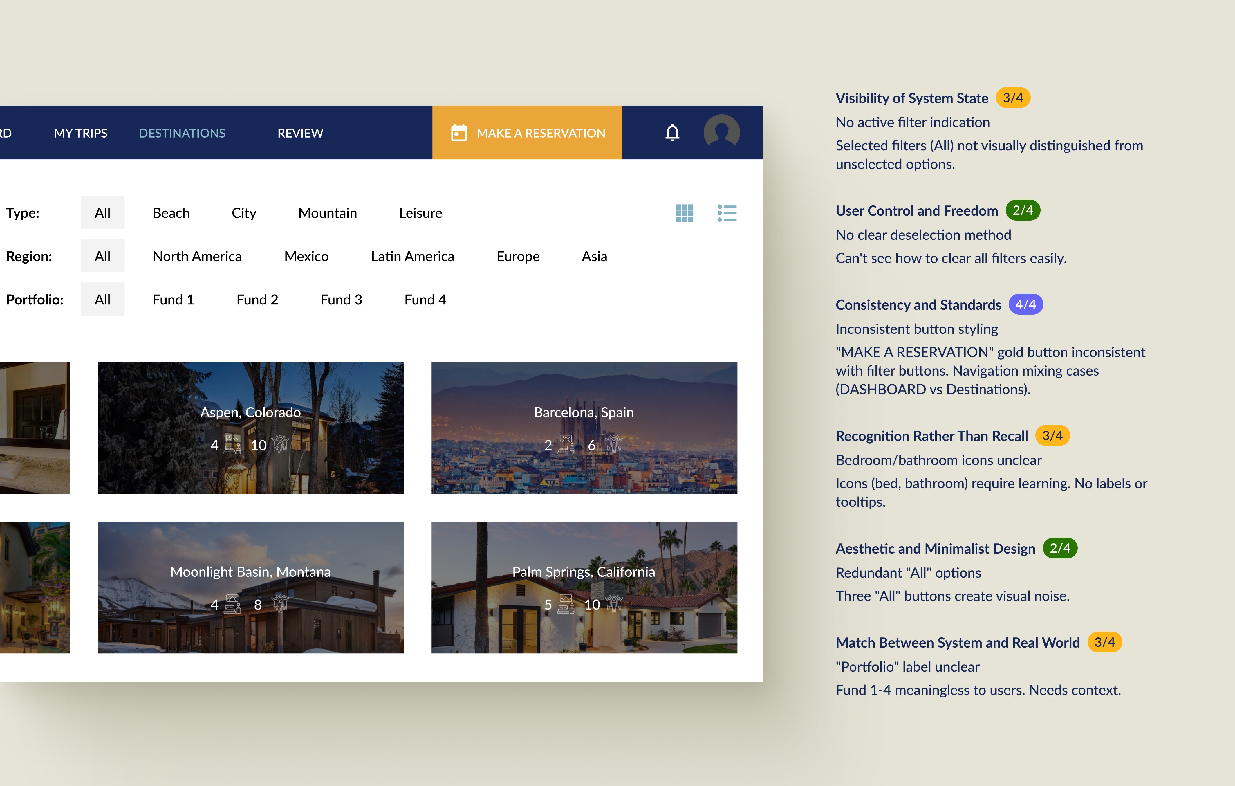
Heuristic Evaluation
Impact
I presented the findings to stakeholders demonstrating why users struggled with the platform. The systematic framework translated subjective complaints into objective violations with measurable severity, building stakeholder buy-in for mobile-first redesign and feature prioritization.
Wireframes
Aligning on structure before visual design
Wireframes showed stakeholders the app structure before visual design. This validated feasibility, surfaced technical constraints, and helped prioritize features for V1 development.
What I wireframed
Search flow (duration selector + timeframe shortcuts)
Booking flow (residence details + balance preview)
Balance system (before/after comparison)
Trip management (itinerary builder + offline access)
What I validated
Information architecture and content hierarchy
User flow logic across booking journey
Feature prioritization (what ships in V1 vs V2)
Interaction patterns (tabs, selectors, progress tracking)
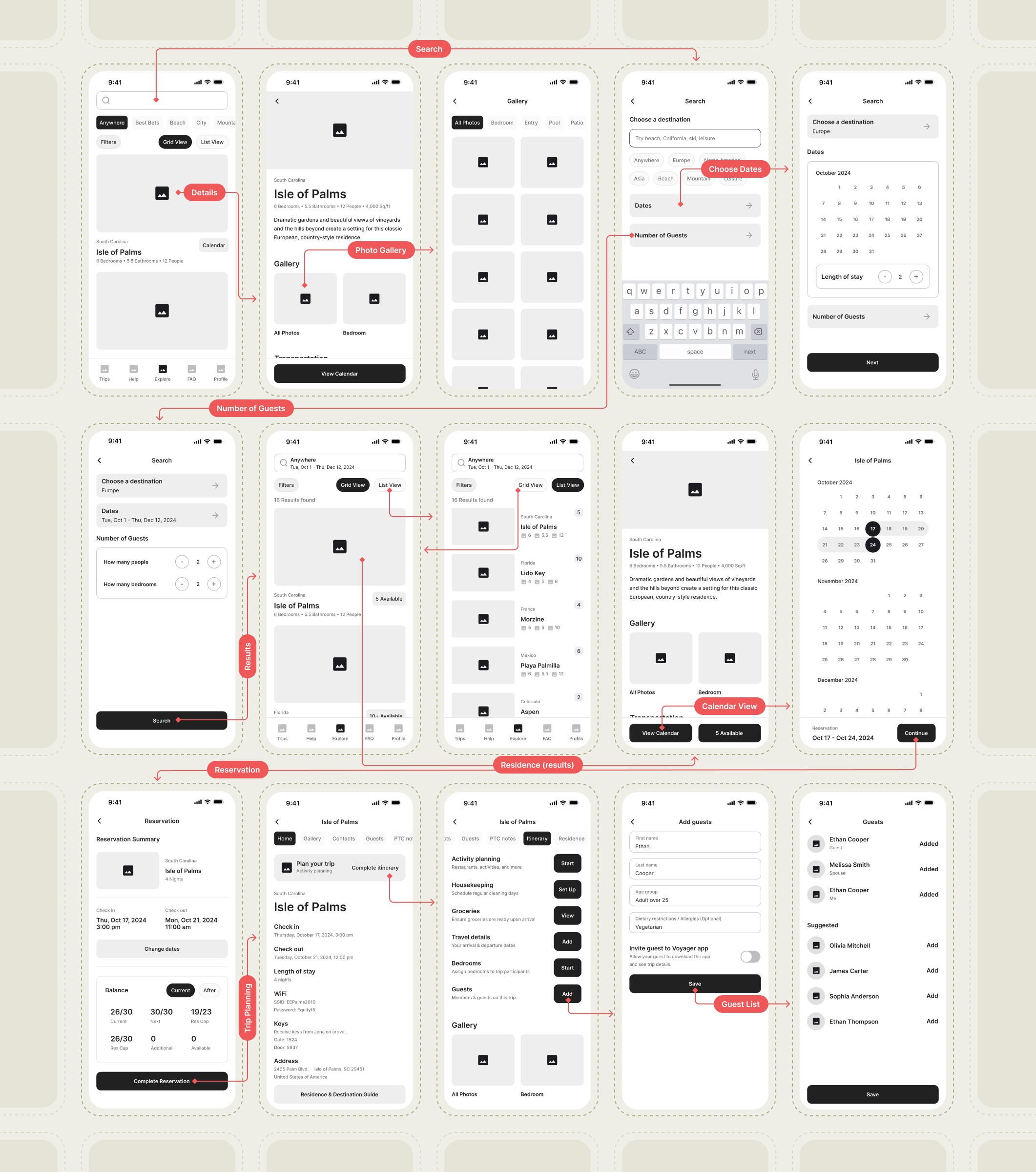
Wireframes
Outcome
No major structural changes needed after stakeholder review. Developers confirmed implementation feasibility. User testing of interactive prototypes validated key flows, with investors responding positively to self-service booking and transparent balance features.
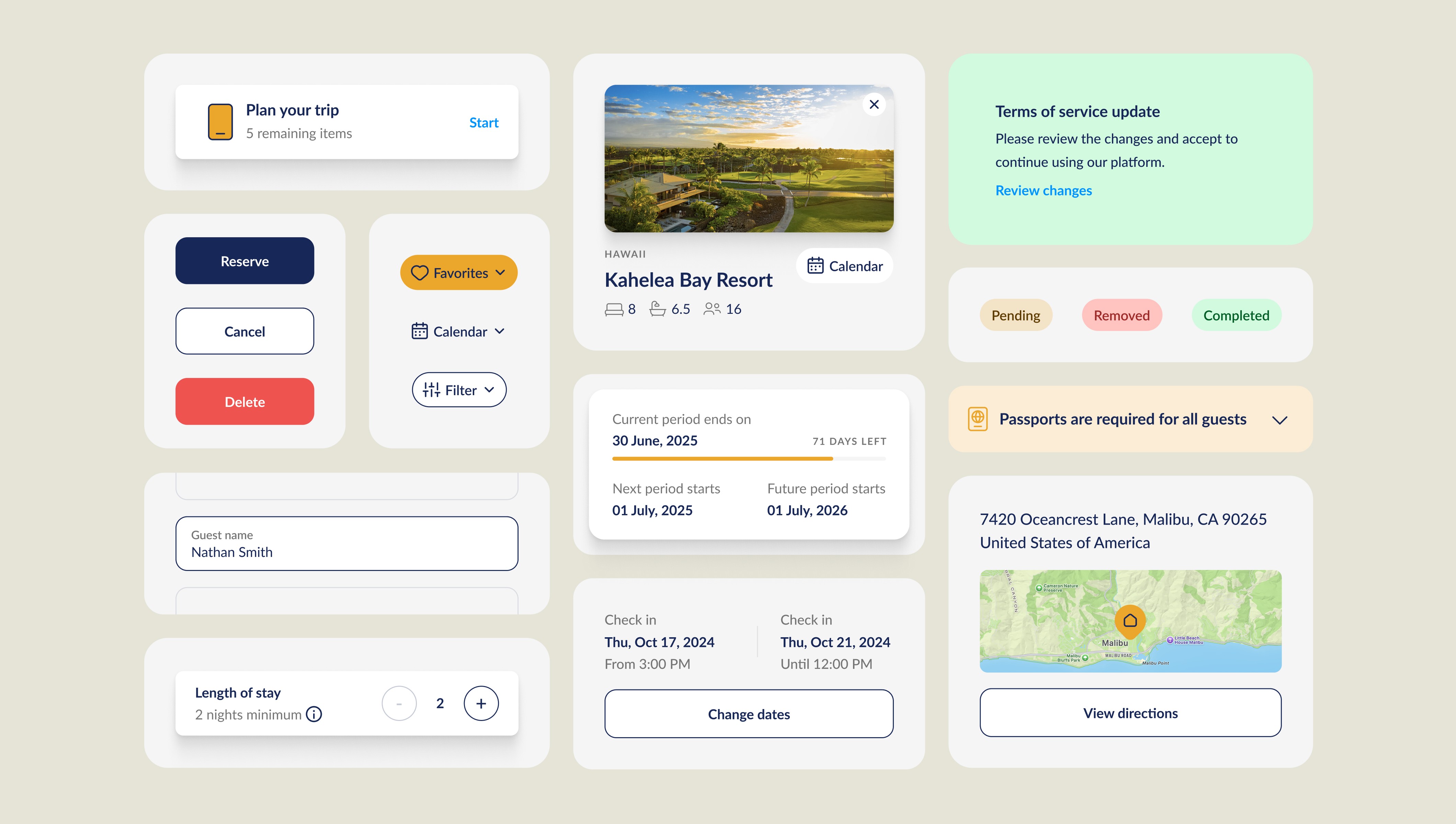
Solution
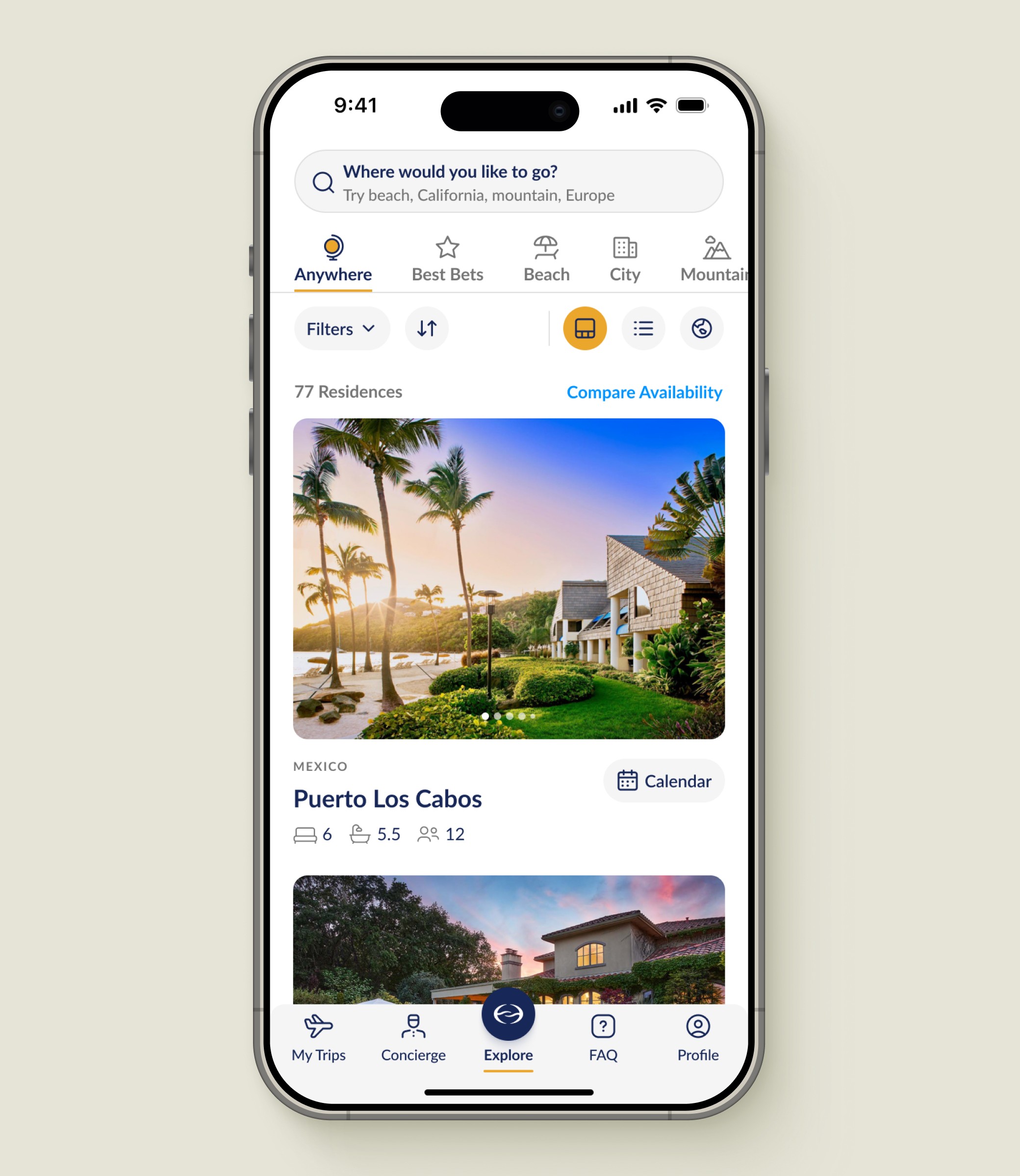
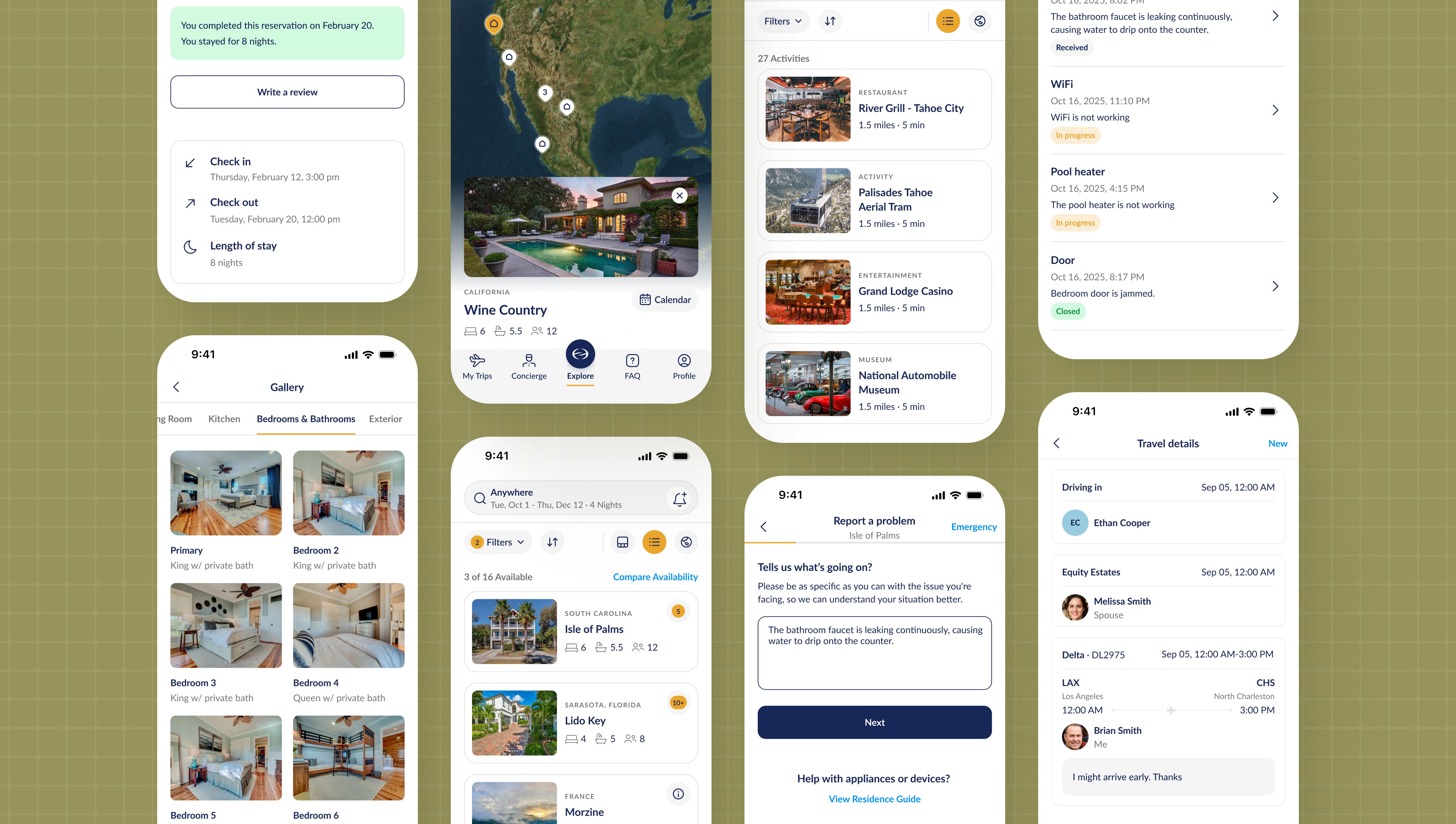
Mobile-First Search
Voyager's search accesses 80+ residences. Unlike traditional platforms requiring exact dates, investors want flexible trips within broader timeframes. I redesigned search around length of stay and flexible date ranges. Results show available residences with dropdowns displaying matching date slots.
Highlights
Length of stay selector in days
Flexible timeframes in months
Dropdown shows available date slots per residence
Results match or exceed selected duration
Why it worked
Matches how investors actually think about trips
Reduces search time by eliminating date guessing
Shows all options within desired timeframe instantly
One-handed mobile operation for on-the-go booking

Search and Results
Solution
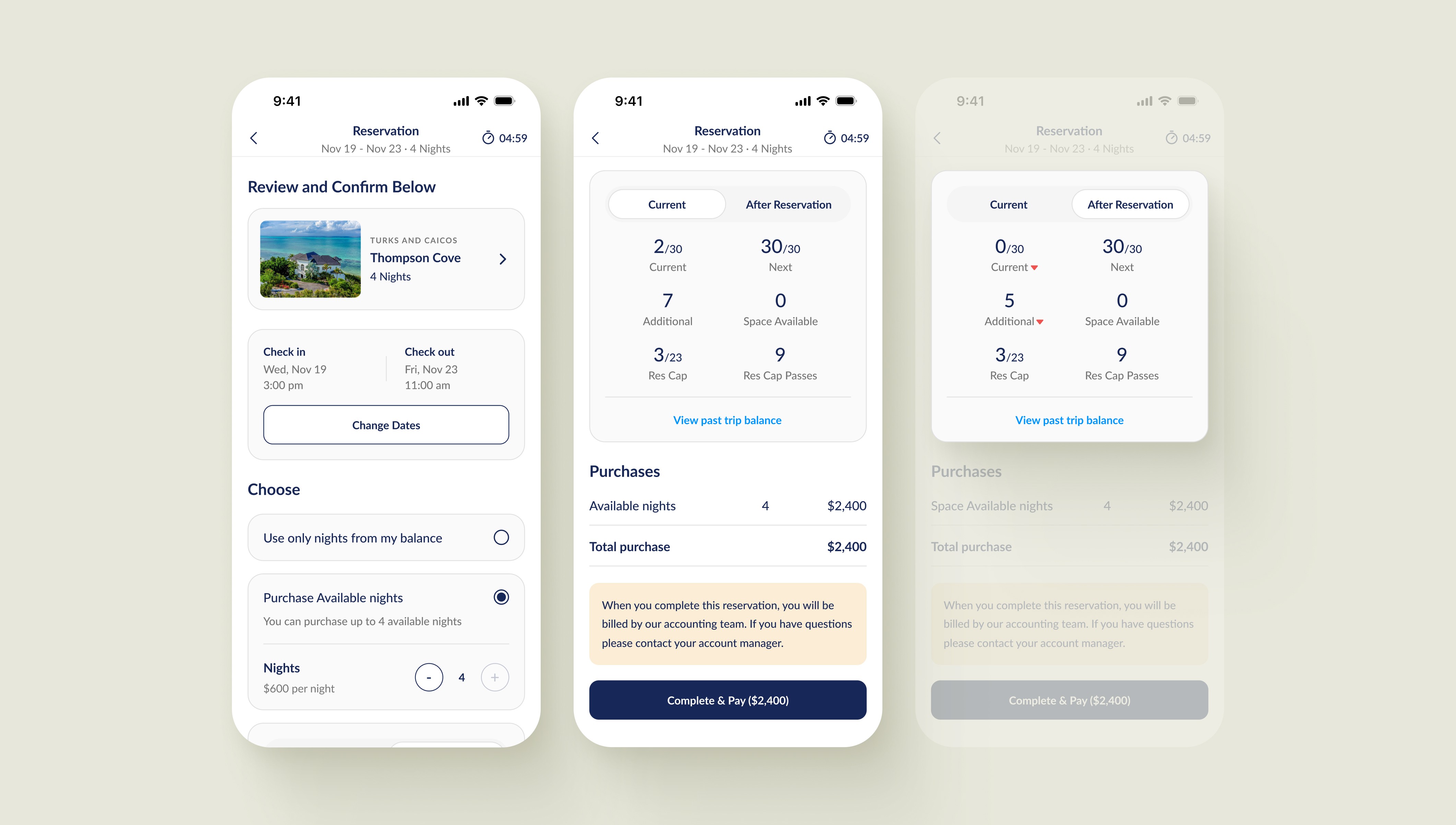
Transparent Balance
The balance system involves multiple night categories with complex allocation rules. After consulting account managers who handle investor bookings and balance questions, I designed a before/after comparison showing balance impact. An itemized breakdown at the bottom reveals exactly which night categories are used, including any purchased nights requiring payment.
Highlights
Before/after comparison tabs on same screen
Shows current balance vs post-booking balance
Itemized breakdown of specific night categories used
Displays purchased nights requiring payment
Why it worked
Users see complete impact before committing
Eliminates balance-related support calls entirely
Transparent itemization builds trust and confidence
All information accessible on single screen
Reservation and Balance
Solution
Complete Trip Management
Guests needed help planning activities at residences. Previously, Voyager sent PDF lists of local dining and entertainment options via email, then manually coordinated reservations through calls and texts. I designed a self-service activity planner where guests browse options, add activities to their calendar as pending, and Voyager confirms reservations directly in-app.
Highlights
Browse local dining, entertainment, and activities
Add selections to calendar as pending
Voyager confirms reservations and updates status
Guests can add personal activities to avoid conflicts
Why it worked
Eliminates PDF attachments and email back-and-forth
Voyager sees all requests in one system
Guests control their schedule in real-time
Edits and cancellations handled through app

Trip Planning and Management
Solution
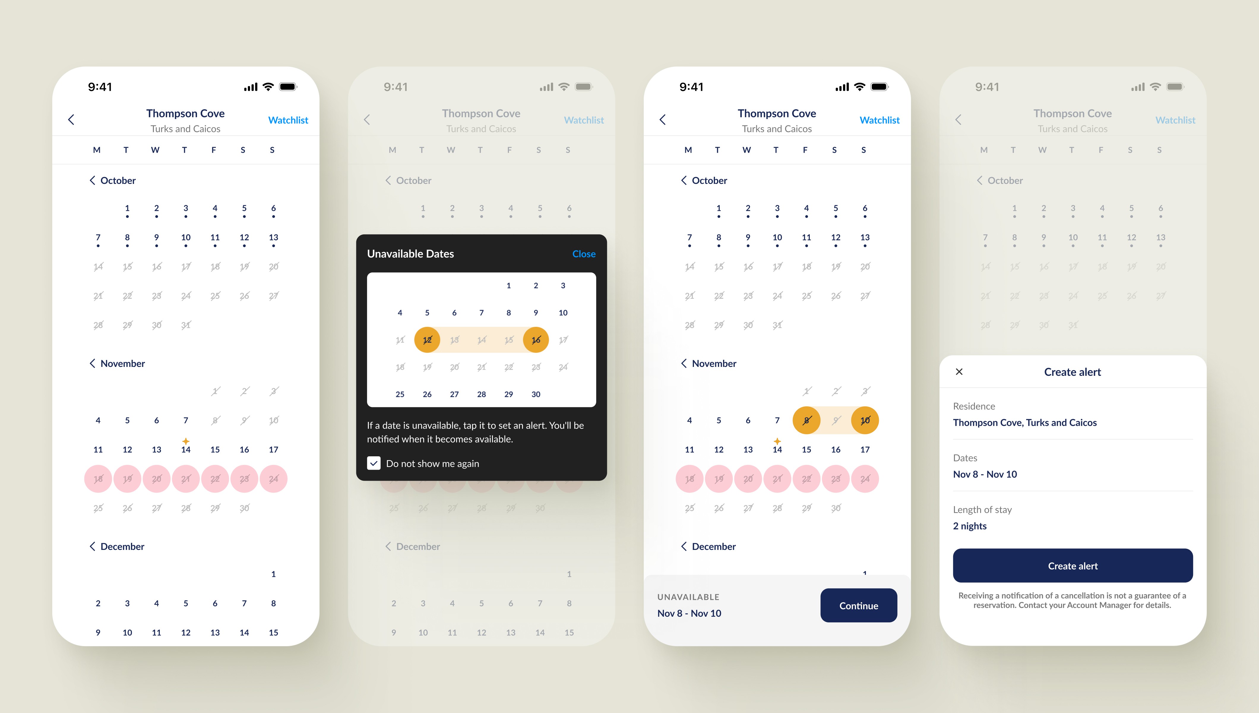
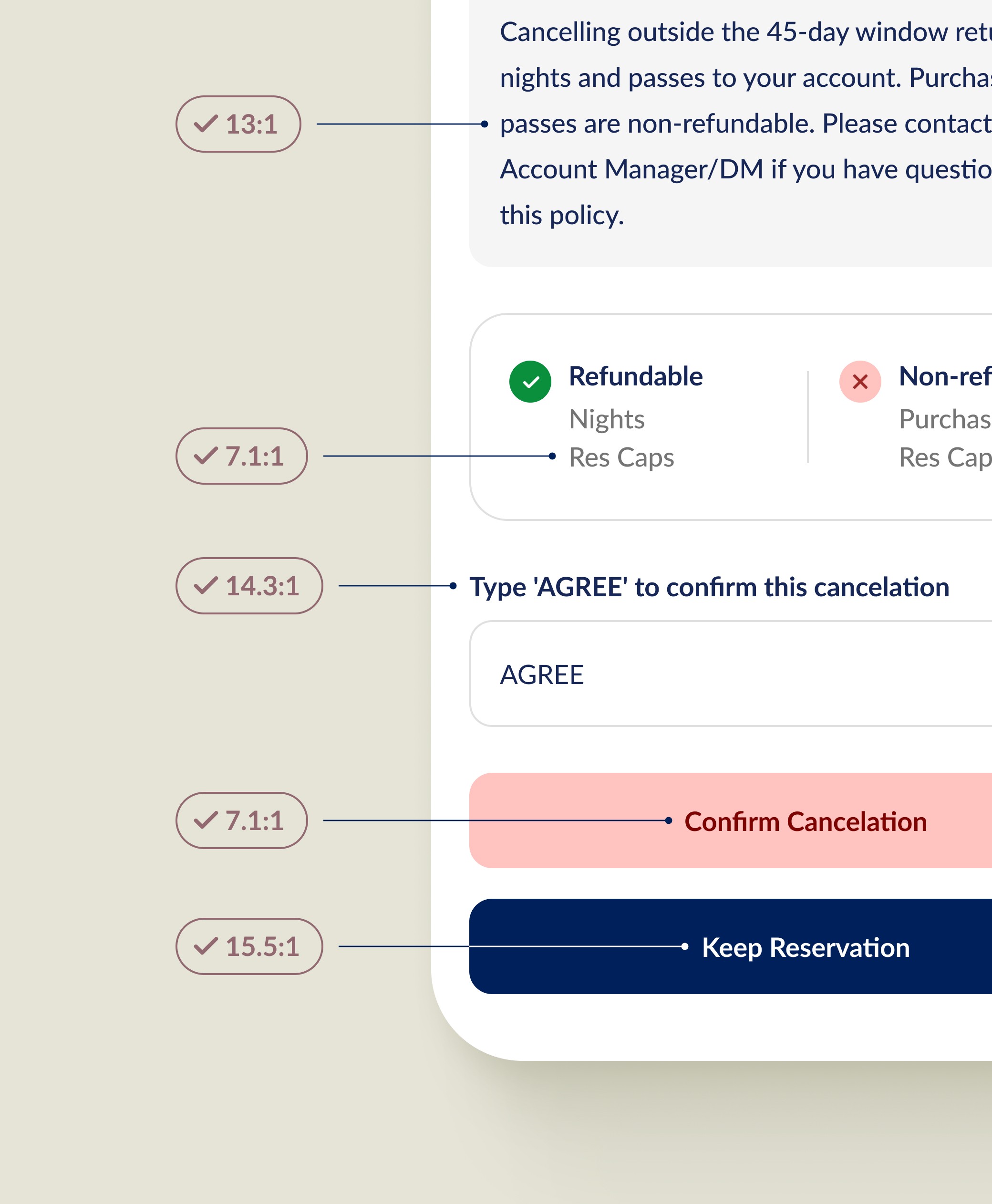
Create Alert for Unavailable Residences
Investors wanted alerts for unavailable dates at favorite residences. The challenge: crossed-out dates signal non-clickable, but users needed to click them to set alerts. I tested video tutorials, alternative visual indicators, and snackbars to show that crossed-out dates were clickable. Video won because users ignored static text. A modal appears after 5 seconds, animating the interaction.
Highlights
Crossed-out dates are clickable to set alerts
Video modal appears after 5 seconds
Animation demonstrates clicking interaction clearly
Action sheet confirms alert creation for preferred dates
Why it worked
Video modal forces focus unlike static text
Animation shows exact interaction users should perform
Users get notified when residence becomes available
Video performed best against static elements
Create Alert
Solution
Compare Residence Availability
Investors needed to compare availability across multiple residences. While showing residence images aids recognition over recall, I prioritized seeing more residences in this context - removing images and keeping only names and locations added 3-4 more properties in the viewport. Unlike web where users memorized dates and booked on separate pages, mobile users select available dates and book directly without leaving the comparison view.
Highlights
Removed images to show 3-4 more properties
7-day calendar with week/day navigation buttons
One residence per row with availability grid
Select and book on same screen
Why it worked
More residences visible in comparison context
Flexible navigation for date exploration
No memorization or screen-switching required
Reduced cognitive load significantly

Compare Availability
Design trade-off
Consistency vs. usability - I use residence images throughout the app for recognition, but comparison required showing more properties simultaneously. Users need to see quantity over imagery when comparing options.
Design system
Creating a Foundation for Speed and Consistency
Built a design system that reduced web development time by 50% and enabled 85% component reuse across iOS and web.
Color System
I built Voyager's color system using a structured tint scale (900-100) for each color family, ensuring consistency across iOS and web. Each primary, neutral, and status color includes nine tints from darkest to lightest, allowing me to maintain visual hierarchy and create accessible combinations while ensuring WCAG AA contrast compliance.
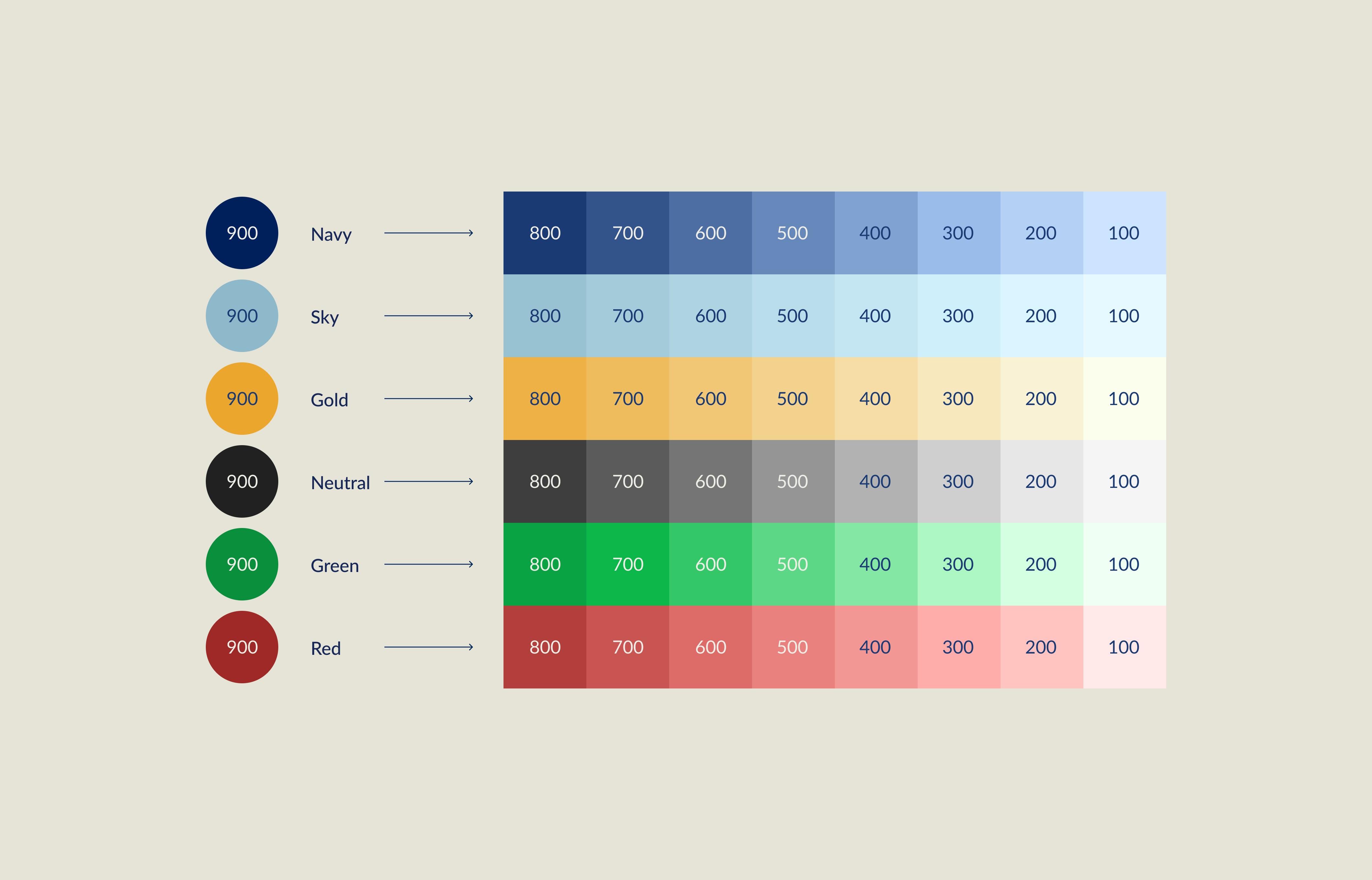
Color System
Contrast and Color Naming
I established semantic color tokens describing purpose over appearance. Instead of "blue-500," I used context-specific tokens like "text-primary," "surface-active," and "border-secondary." This ensures tokens remain meaningful when values change, maintaining consistency across iOS and web while helping developers understand intent.
I ensured all color combinations meet WCAG AA standards (4.5:1 for text). Each element was tested for contrast ratios, with Navy-900 achieving 15.5:1 for critical actions. Lighter tints maintain accessibility for secondary elements, guaranteeing readability across all contexts.
Contrast Ratios

Color Naming
Component Library
I built a comprehensive component library defining reusable design patterns across Voyager. Buttons, cards, inputs, badges, and modals follow consistent spacing, typography, and color tokens. This systematic approach ensured design consistency, accelerated development, and enabled seamless updates across iOS and web platforms.
Components
Typography
I established a clear type hierarchy prioritizing accessibility for investors in their 50s-60s. Using iOS default Dynamic Type, I enabled font scaling up to XXXL through accessibility settings. This allows users to adjust text size system-wide, ensuring readability without compromising hierarchy or layout.

Typography Sizing

Default Type Size

XXXL Type Size
impact
From Support-Dependent to Completely Self-Sufficient
The redesign reduced support dependency and operational costs. Self-service booking and transparent balance display eliminated the most common support calls. The activity planner replaced manual coordination workflows, freeing account managers for high-value investor relationships.
Mobile-first design enabled on-the-go booking, increasing engagement. Most importantly, the platform became scalable and growth no longer required proportionally increasing expensive concierge staff, removing a critical business constraint.
Before
200+ support calls/month
45% booking abandonment rate
8-minute average booking time
After
40 support calls/month
12% booking abandonment rate
2-minute average booking time
80%
Reduction in support calls
75%
Faster booking time
95%
Self-service adoption
90%
investor app usage
Key learnings
What I'd Take to My Next Project
Design within constraints, not around them
Early developer collaboration shaped feasible solutions for balance display and activity booking. Understanding technical limits upfront prevented late-stage compromises.
Prototype the unclear, not the obvious.
Testing clickable crossed-out dates and balance flows revealed where assumptions failed. Early validation saved costly post-launch changes.